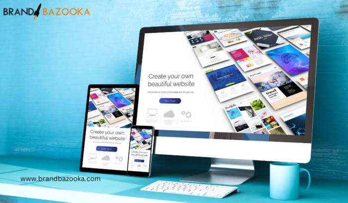
The significance of web design for SaaS companies transcends mere aesthetics, encompassing several interconnected facets that work in harmony to create a holistic and impactful user experience.
This article delves into web design tips for SaaS companies, offering expert insights and best practices that will aid you in crafting a website that not only drives traffic, but also transforms visitors into devoted customers. 🌟
1. First Impressions: Crafting Emotional Connections 🤝
Beyond capturing attention, a well-crafted design has the potential to foster emotional connections. In today’s saturated digital environment, it’s not just about getting noticed; it’s about leaving a lasting impression that resonates with your target audience. Delving into user preferences, demographics, and behaviours enables you to craft a design that speaks directly to your audience, creating an emotional bond that goes beyond the surface.
2. Brand Image: Consistency Across Dimensions 🎨
Consistency in design extends beyond visual elements. It encompasses the tone, personality, and values of your brand. Every interaction on your website is an opportunity to reinforce your brand image. Ensuring that your design is in alignment with your brand’s narrative creates a cohesive and memorable experience for users. From the colour palette to the typography, from the imagery to the copy, each element should work together to convey your brand’s essence.
3. User Experience (UX): Navigating with Purpose 🌐
A well-executed website design enhances the user experience, simplifying the comprehension of your SaaS product’s features and advantages. A seamless UX naturally results in heightened engagement and improved customer retention rates.
Intuitive navigation isn’t just about simplicity; it’s about guiding users effortlessly towards their goals. The strategic placement of elements, the hierarchy of information, and the seamless transition between sections all contribute to a fluid user experience that keeps visitors engaged and encourages them to explore further.
4. Conversions: The Art of Compelling Action 📈
Strategic calls-to-action (CTAs) are akin to signposts that guide visitors on a path towards conversion. However, the journey isn’t one-size-fits-all. Employing A/B testing allows you to experiment with different placements, colours, and wording for CTAs, refining your approach based on real user responses. This iterative process ensures that your CTAs are not just appealing visually, but also psychologically, compelling users to take action without feeling coerced.
5. Differentiation: Beyond Features, Showcasing Experience 🌟
While highlighting unique features is essential, showcasing them creatively can set your SaaS apart. Integrating interactive elements, such as dynamic infographics or interactive product tours, engages users on a deeper level. Immersive experiences that allow users to interact with your solution before committing create a sense of ownership, fostering a stronger connection between the user and your product.
6. Mobile Optimization: Beyond Responsiveness, Tailoring for Mobile 📱
With mobile devices becoming the primary tool for browsing, mobile optimization transcends mere responsiveness. It involves creating mobile-specific features that cater to touch interactions. Implementing features like click-to-call buttons, simplified navigation menus, and streamlined forms ensures that the mobile user experience is as seamless and satisfying as the desktop counterpart.
7. Clear CTAs: The Psychology of Persuasion 📣
Clarity and visual prominence in CTAs are vital, but delving into the psychology of persuasion takes it a step further. Employing action-oriented verbs, creating a sense of urgency, and offering exclusive benefits can motivate users to take action. Effective CTAs go beyond buttons; they’re invitations that entice users to become active participants in their journey on your website.
8. Speed: Pace and the Unseen Impact ⚡
Consistency goes beyond design elements. It extends to your website’s loading speed. Slow-loading websites lead to frustration and increased bounce rates. Optimizing images, minifying code, and leveraging caching mechanisms are just a few techniques that ensure swift load times. A fast website not only enhances user experience but also contributes positively to search engine rankings.
9. White Space: Conveying Professionalism and Sophistication 🧐
White space isn’t just about enhancing readability; it also influences user perception. A clean, uncluttered design with well-considered white space can convey a sense of professionalism and sophistication. This uncluttered approach imparts a sense of order and clarity, reinforcing your brand’s credibility.
10. Scan ability: Micro interactions Guiding Attention 📖
Enhance scan ability with micro interactions that guide users’ attention. Subtle animations hover effects, and visual cues direct users toward essential information. These interactions not only make the content more engaging but also facilitate the absorption of key details, even during a quick scan.
11. Support: Empowering with Self-Help Resources 🆘
Incorporating accessible customer support options, such as chat bots or live chat, is essential. Yet, extending support to self-help resources empowers users to troubleshoot on their own. A robust knowledge base or a resource hub can instil a sense of independence, enhancing user satisfaction and reducing the strain on your support team.
12. Testing and Evolution: Iterative Enhancement beyond Design 🔄
The power of A/B testing doesn’t stop at design elements. It extends to content and layout changes as well. Experimenting with different content formats, such as videos, info-graphics, or interactive elements, provides invaluable insights into user engagement. By iteratively refining your content strategy, you create a website that evolves in tandem with user preferences.
13. Social Proof and Testimonials: Real-World Validation 🧪
Integrating genuine customer testimonials and case studies goes beyond design—it’s about substantiating claims. These elements provide tangible social proof and showcase real-world success stories. By sharing the experiences of satisfied customers, you bolster your credibility and offer potential customers a glimpse into the actual value your SaaS provides.
14. Security and Trust Indicators: Addressing Concerns Proactively 🔐
In an era where data security is paramount, visibly displaying trust indicators, such as SSL certificates or security badges, is imperative. These indicators assure visitors that their sensitive information is safe with you. Proactively addressing security concerns can alleviate any apprehensions about sharing personal or financial details.
15. Analytics and Data Collection: Informed Evolution 📊
Incorporating robust analytics tools goes beyond just monitoring metrics—it’s about informed evolution. Tracking user behaviour, click-through rates, and conversion paths provides a data-driven foundation for continuous improvement. Armed with these insights, you can tailor your design and content to better align with your audience’s preferences and needs.
Read Also: – Five Things to Consider When Choosing a Website Development Company in Delhi
In summation, the realm of web design for SaaS companies transcends the visual, embracing an intricate tapestry of elements that converge to create an impactful and meaningful user experience. By holistically considering these Saas Website tips and tricks, you elevate your SaaS website from a mere digital presence to an immersive platform that drives growth, fosters loyalty, and establishes your brand as a leader in the competitive landscape.
The process of designing SaaS websites can be complicated and hence it is advisable to hire web Design Company in India for SaaS website designing requirements.
If you want such a website development company for your SaaS website, I strongly recommend Brand Bazooka, a web design company based in Gurgaon. Brand Bazooka has helped numerous brands grow with their SaaS website ideas and strategies and can help you too.


